Springboks RWC Campaign Visualization

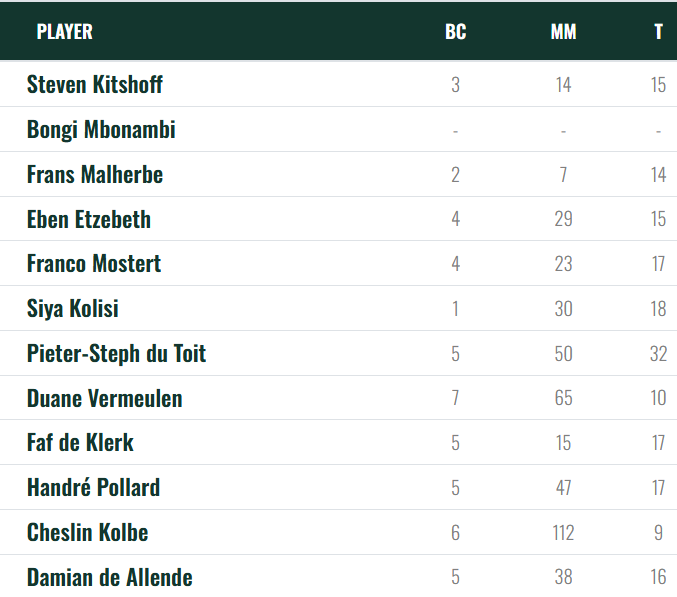
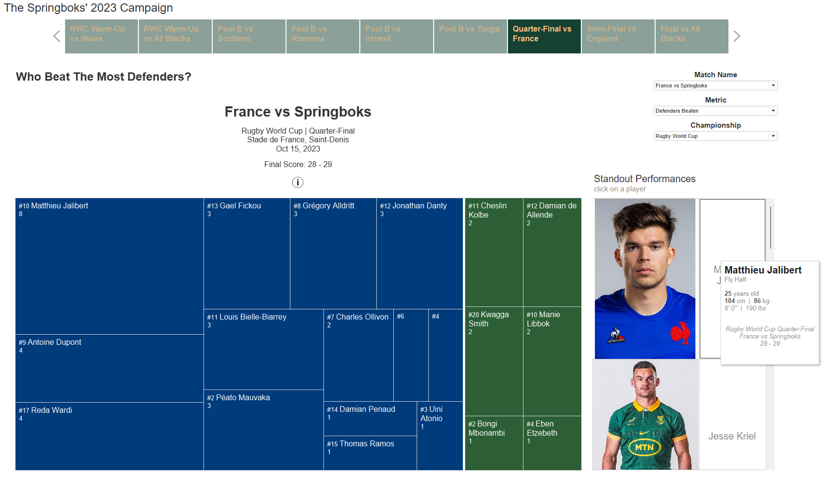
Springboks 2023 Rugby World Cup Campaign Data Visualisation

This project visualises South Africa’s journey through the 2023 Rugby World Cup — one of the closest campaigns in the history of the tournament. The Springboks managed to win by a single point in every match of the knockout stages. As a passionate rugby fan, I was inspired and challenged to use my skills to capture the drama and the intensity of their campaign using match data, especially after witnessing the nail-biting quarter-final against France.

Project Highlights

  • Sourcing and working with official match data
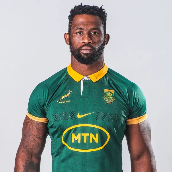
  • Integrating player images with data visualisations
  • Data enrichment to create a visual storytelling experience
South African Rugby Union data visualization

Sourcing the Data

The core performance data for this project was sourced directly from the official South African Rugby Union website. This dataset includes performance metrics for each player such as meters gained, tackles made, ball carries, defenders beaten, offloads, turnovers made, and general play kicks.

In addition to performance statistics, I scraped contextual information such as the stadium where the match was played, the referee, linesmen and television match officials for each match from the SA Rugby website to enrich the dataset and provide a comprehensive view of each match.

To enhance the dataset further, I expanded data sourcing to cover every team that competed against South Africa in the RWC Warm-Ups, the 2023 Castle Lager Rugby Championship and the Rugby World Cup. Player images and biography data such as each player's height, weight, and age were scraped using UiPath Studio from the official rugby union websites of each nation. These datasets were then integrated in Microsoft Excel.

Headshot of a rugby player used in the dashboard

Player Images

To make the dashboard more engaging and personal, I integrated player headshots for every team. The goal was to give each player a visual presence in the dashboard.

During the data scraping process outlined in the previous section, I downloaded and compressed the image files for each player, and then uploaded them to an image hosting website to generate public image URLs.

These URLs were then added to the dataset, allowing Tableau to display each player’s image dynamically throughout the dashboard.

Data Enrichment

This was one of the most exciting parts of the entire project — and honestly, I was suprised by how much it helped to tell the story of the campaign. I created a table to highlight standout performances from each match, with URLs to short-form content from Tik-Tok and Instagram for specific moments. Altogether, I sourced and linked 71 highlight reels across the dataset.

The clips showcase some of the most entertaining and defining moments of the campaign: sidesteps, hard collisions, and ultra instinct level execution. These include Siya Kolisi’s inspirational return from an ACL injury just in time for the World Cup, Damian de Allende’s hard running against the Irish in the group stages, and Jesse Kriel’s legendary performance in the quarter-final against France.