Zimbabwe 2018 Election Results Analysis

In the lead-up to Zimbabwe’s 2023 elections, I took a step back to examine one of the country’s most contentious democratic moments—the 2018 presidential election, the first after Robert Mugabe’s exit. The election was fraught with controversy, confusion, and widespread allegations of electoral fraud. Many people still didn’t fully understand why the MDC lost, despite strong public support. So I set out to investigate.

Project Highlights

  • Sourcing the official election results data
  • Visualising the 2018 highly contested election results
  • Writing an in-depth article analysing the election and its controversies

Access the Dashboard and Article

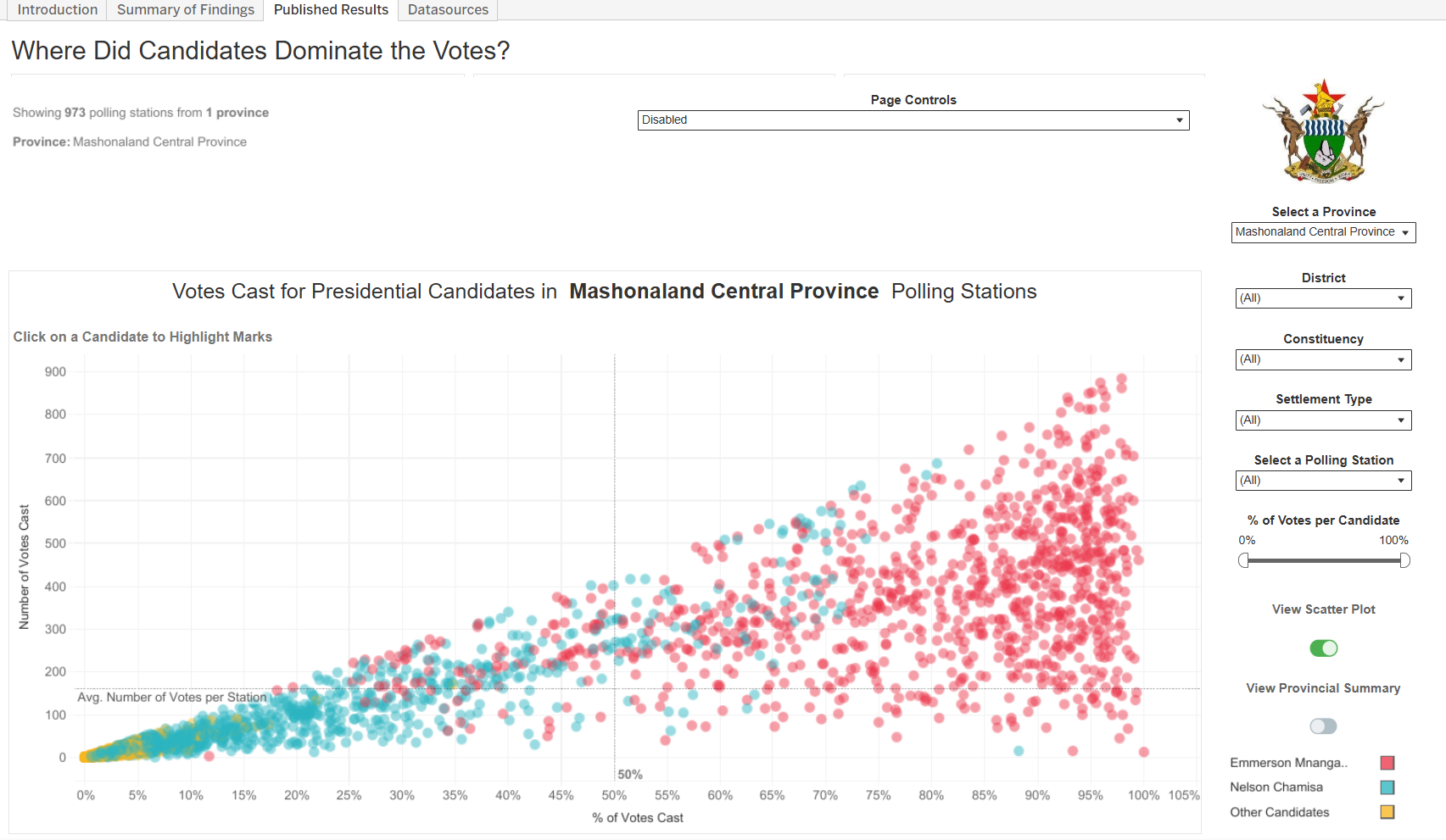
Explore the interactive Tableau dashboard visualising the 2018 election results, and dive into the in-depth article that uncovers key findings and context.

Zimbabwe Electoral Commission data files

Sourcing the Election Results Data

The election results data was sourced directly from the Zimbabwe Electoral Commission (ZEC) website. The data was provided as separate files for each of Zimbabwe's provinces, detailing total votes cast per candidate at individual polling stations.

I downloaded all provincial datasets—covering all ten provinces—and appended them in Excel to create a comprehensive national dataset. After performing necessary light cleaning and formatting, the consolidated data was imported into Tableau for detailed analysis and visualisation.

Visualizing election data by polling station

Visualising Election Data

Once I compiled the national dataset, I wanted to dig deeper into how each candidate performed across the country — not just by province, but down to the individual polling station.

It was fascinating to see how different candidates had strongholds in very specific areas. Visualising the percentage of votes each candidate received at each station helped highlight those contrasts.

To make these differences stand out more clearly, I used scatter plots to show both the percentage of votes and the number of votes cast per station. That way, you could not only see where a candidate was popular, but also where voter turnout was high or low.

Rugby data graphic

Writing the Article

After spotting anomalies in the raw data from the Zimbabwe Electoral Commission, I knew the story required more than numbers—it needed solid context and evidence. I turned to the official Constitutional Court judgment from the 2018 election, carefully reading affidavits, transcripts, and legal arguments to build an accurate picture.

Each claim in the article is backed by primary evidence, with hyperlinks to specific pages in the court documents, so readers can verify everything for themselves. This wasn’t just journalism—it was a careful effort to document a complex and pivotal moment in Zimbabwe’s history with clarity and integrity.